Key Takeaways
- Card UI patterns adapt quickly to different devices, supporting responsive and modular layouts.
- Consistent and intuitive card design leads to higher engagement and accessibility for diverse user groups.
- Understanding and selecting the best card layout pattern is crucial for presenting information effectively.
Mobile app interfaces are constantly evolving to deliver smoother, more intuitive user experiences. Among the most influential design patterns is the use of cards, flexible, modular components that bundle information and functionality into easily scannable units. Whether showcasing images, text, or calls to action, card-based design makes content more approachable and visually engaging. To learn more about successful implementations and inspirations, you can explore leading examples on this card UI resource.
Modern mobile designs rely on cards for their ability to organize data into bite-sized, actionable elements. This method not only enhances browsing but also supports responsive layouts across a variety of screen dimensions and orientations. Adopting card-based patterns can help mobile apps stand out in crowded app stores and improve both usability and retention rates.
Understanding Card UI Patterns
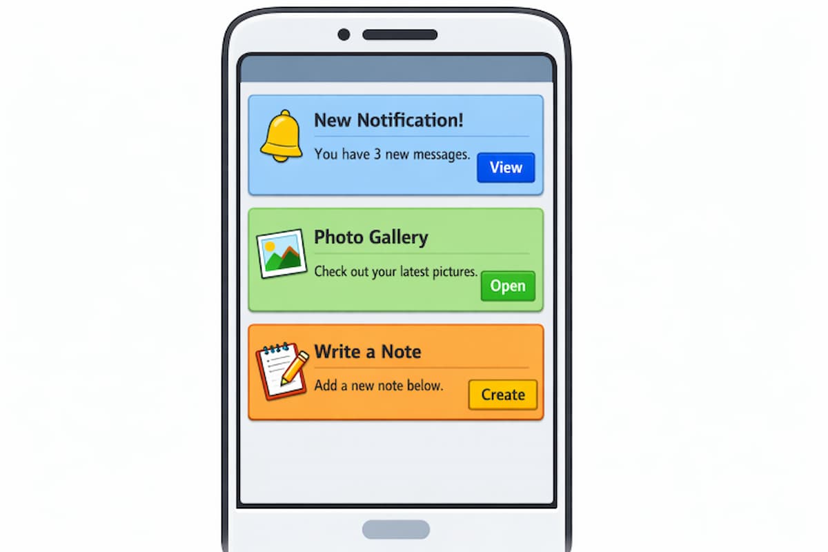
Card UI patterns employ rectangular containers to organize related data, from media to text and interactive components. Mirroring the look of physical cards, this approach fosters familiarity and ease of use. Cards have become essential in mobile interfaces due to their modular structure, which helps designers adapt content presentation across devices from phones to tablets. Cards accomplish much more than simply packaging information. They facilitate content sorting and prioritization, allowing users to focus on individual items without feeling overwhelmed. This modularity makes them particularly effective for complex apps, such as news aggregators, social networks, and e-commerce platforms.
Benefits of Card-Based Design
Implementing card-based design offers a plethora of advantages for mobile app developers and users alike:
- Modularity: Cards work as independent blocks, allowing designers and developers to insert, rearrange, or remove content without disrupting the entire interface.
- Responsiveness: Because cards can be resized and reordered, they adapt seamlessly to a wide range of screen sizes and devices.
- Scannability: By breaking content into digestible components, cards help users process information faster, improving findability and minimizing cognitive load.
Best Practices for Designing Mobile Card UIs
Effective card UIs require attention to layout details, consistency, accessibility, and interactive feedback. The following best practices can help you build mobile card layouts that stand out and enhance the user experience:
1. Maintain Consistency
Uniformity in card style, such as spacing, borders, fonts, and iconography, creates a polished, reliable interface. Whether your app’s cards are used for product listings, news stories, or user profiles, maintaining a consistent design language helps users learn more quickly. Consistency also boosts aesthetic appeal, aiding brand recognition.
2. Prioritize Content Hierarchy
Visual cues like color, size, and typography establish a clear information hierarchy. Emphasize headlines or important actions with larger fonts or contrasting backgrounds, while less critical details, like descriptions or secondary actions, can be set in lighter or smaller text. Proper hierarchy helps users scan and act quickly, reducing frustration.
3. Optimize for Touch Interactions
Cards must invite interaction, so every interactive region should be large enough to do so. Design recommendations, such as those in Apple’s Human Interface Guidelines, specify a minimum tap target size of 44 by 44 pixels. Sufficient spacing around buttons and tappable areas prevents mis-taps, which is critical on small screens.
4. Incorporate Visual Feedback
Instant visual feedback, such as card shading, color changes, or loading indicators, reassures users that an action has been recognized. Whether highlighting a card when pressed or animating transitions, visual cues improve interactivity and intuitiveness.
Common Card Layout Patterns
Choosing the right card layout pattern depends on your app’s function and the content it displays. Here are the most popular approaches:
1. Grid Layouts
Grid layouts align cards within fixed or variable-width columns, organizing information in tidy rows and columns. This approach is ideal for displaying similar items, such as products, photos, or profiles, in systematically spaced grids. Typical desktop grids feature 2 to 4 columns, whereas mobile versions typically use a single column for readability and touch comfort.
2. Masonry Layouts
Masonry layouts arrange cards in a visually compact manner, filling vertical gaps with items of differing heights. Commonly used for displaying image galleries or Pinterest-style feeds, masonry layouts prioritize efficient space use while maintaining a left-to-right reading order. Implementing true masonry often requires JavaScript or advanced CSS grid settings.
3. Carousel Layouts
Carousel layouts organize cards horizontally, presenting featured content in a swipeable row. This is especially effective for highlighting promotions, suggesting related items, or showing a sequence of featured stories. Carousels are widely adopted when space is limited, but the diversity of showcased content is important.
Enhancing Accessibility in Card Design
Inclusive design principles are essential for mobile success. Accessible card UIs prioritize usability for all, including those relying on assistive technologies:
- Keyboard Navigation: Every interactive feature within a card should be accessible through keyboard shortcuts, not just touch or mouse controls.
- Screen Reader Compatibility: Implement semantic HTML and ARIA attributes so screen readers can present clear, context-rich content to visually impaired users.
- Color Contrast: Sufficient contrast between foreground and background elements ensures text and icons are readable by everyone, particularly users with vision challenges.
To deepen your understanding of accessibility in web and mobile design, visit the resources provided by W3C’s Web Accessibility Initiative.
Conclusion
Leveraging effective mobile card UI patterns transforms user experiences, making apps both visually pleasing and functionally robust. By implementing thoughtful structures, prioritizing accessibility, and following best practices, designers can craft interfaces that elevate content while serving diverse audiences. Consider each card a building block, capable of both simplifying information and inviting meaningful interactions.

